“Did it myself” Rosie Illustration Process & Comparison
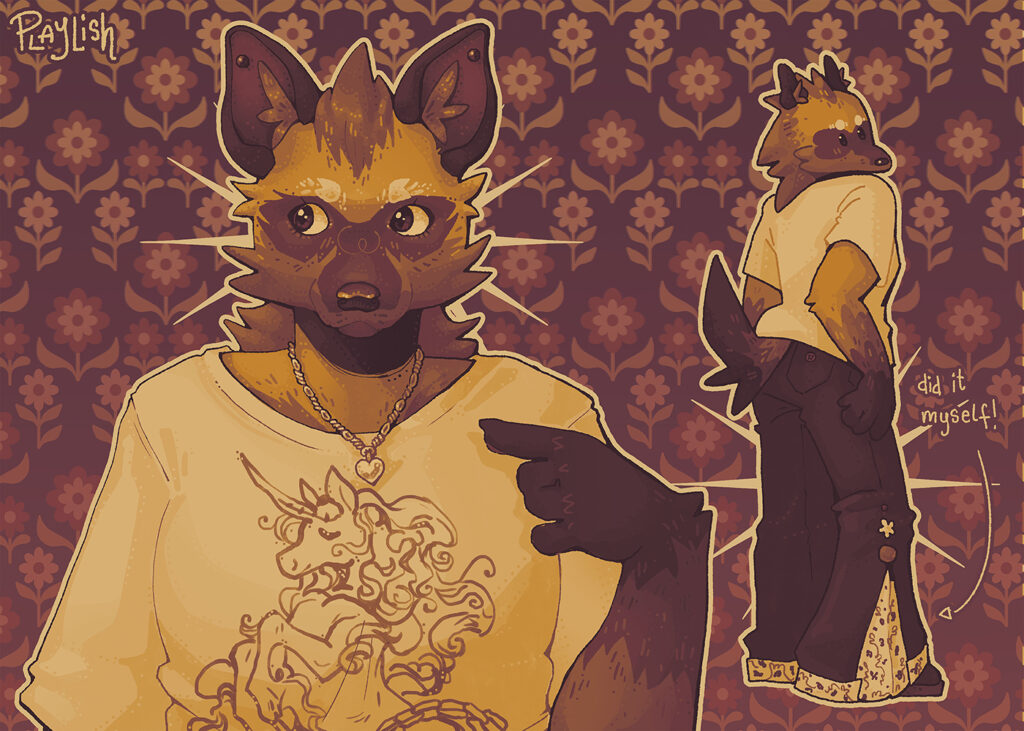
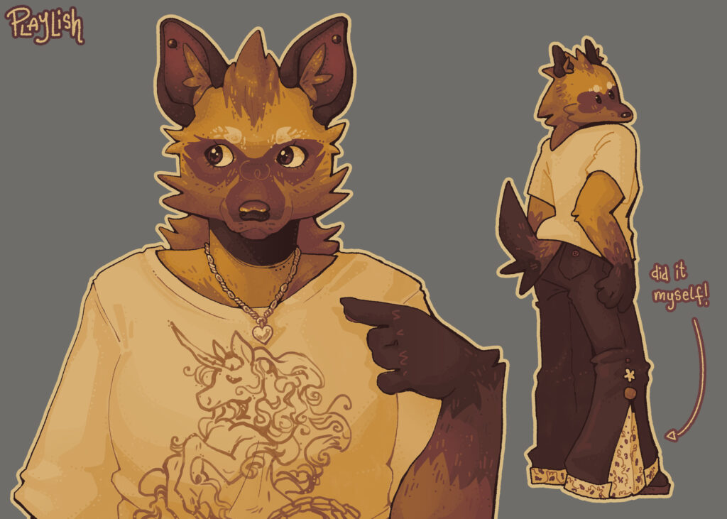
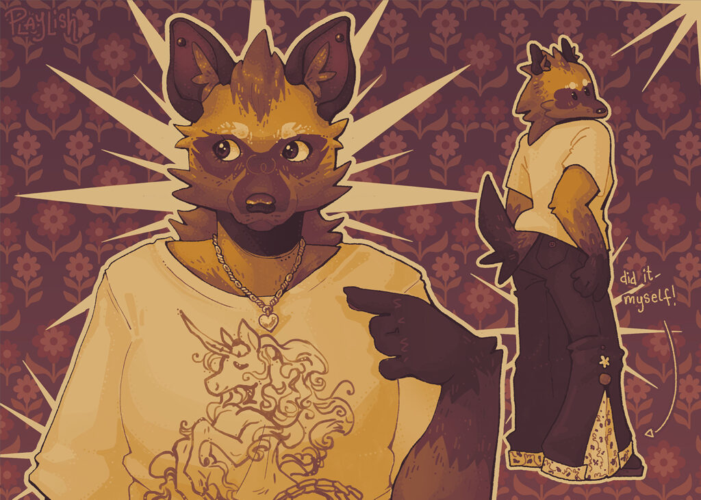
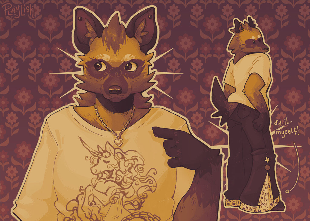
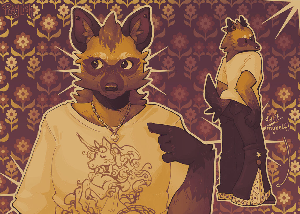
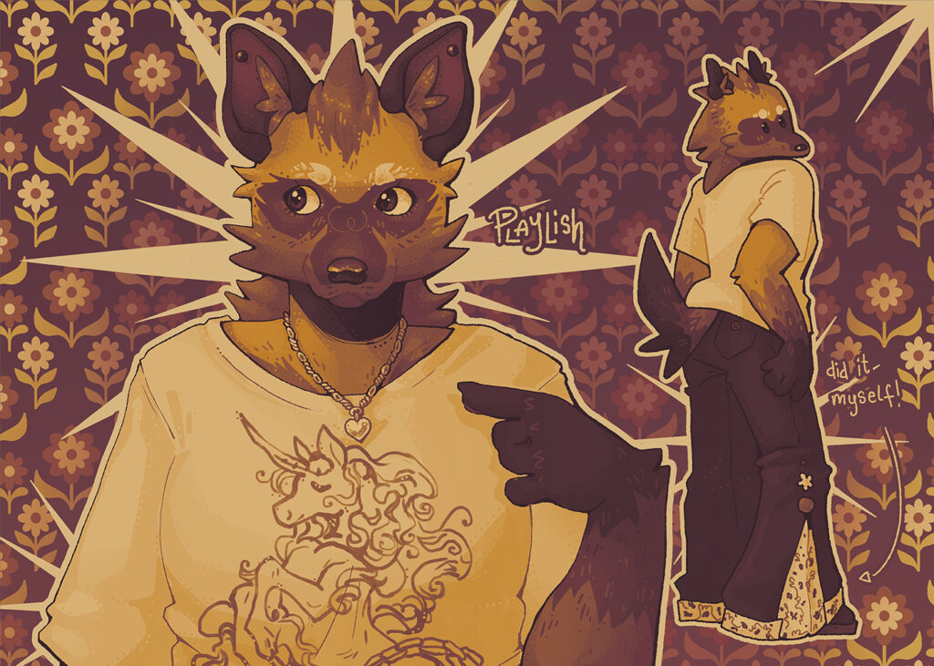
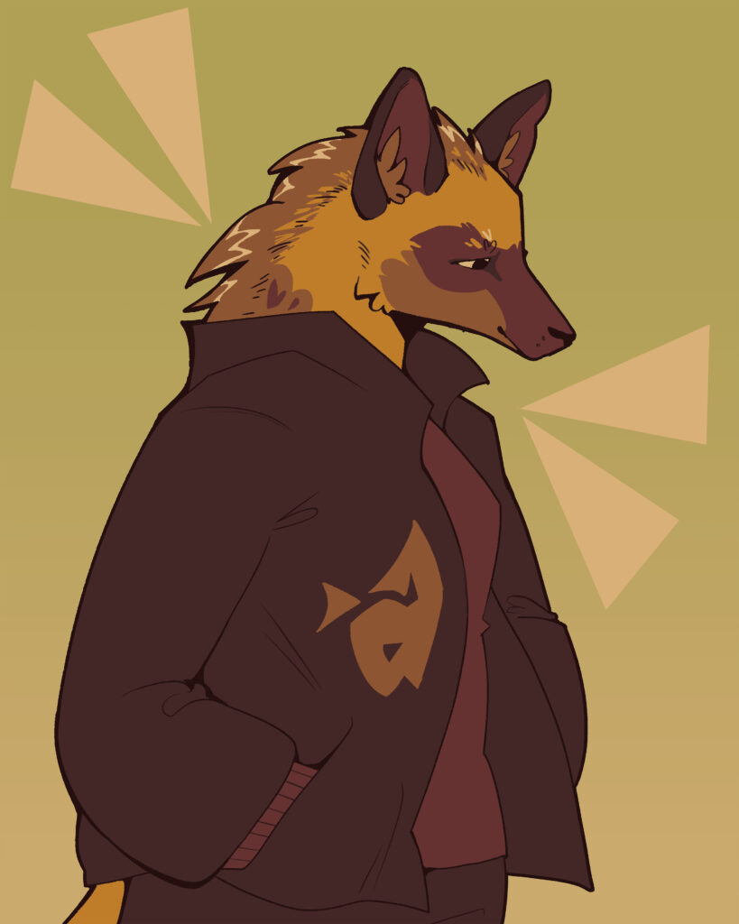
My (currently) newest piece, “Did it myself”. This piece depicts a full body of Rosie wearing a pair of altered jeans as well as a bust of Rosie, which was originally meant to be another expressive pose, but turned into more of a detail-focused feature. These jeans are based off a real-life project that I recently completed and needed to put Rosie in.
Process
Ideation & sketching
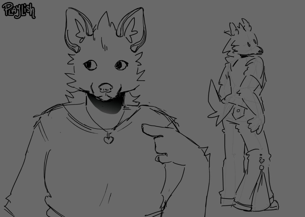
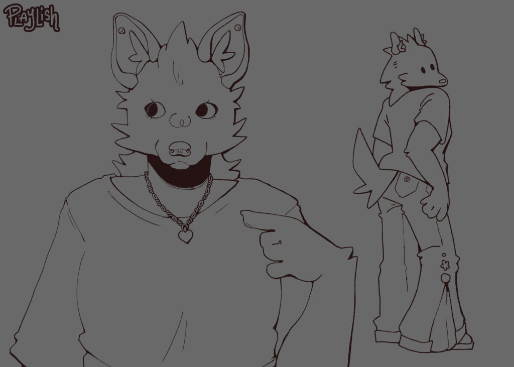
So, how did I make this drawing? The same way I make most of my pieces. Firstly, I simply had an idea. For this particular piece, I was inspired by a pair of pants. I knew that the interesting part of the pants was the side and the cuff, meaning I would need to draw a full body in a pose that shows the side of the leg.
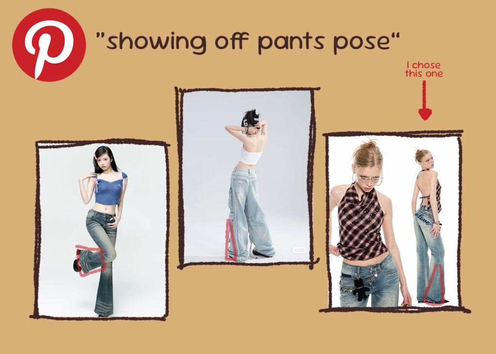
Once I have the vague idea of what I’m wanting, I head on over to Pinterest and search for some pose references. When searching, I tend to just be as direct as possible with my wording, and usually the results are alright.
Here I’ve highlighted the specific part of the pants I was looking to be shown off with the pose! The one that I ultimately chose showed the side of the pant leg the most clearly.
I then use this image as a reference and draw my character! I make sure to keep in mind the differences in body type between the model and my character to ensure (some) consistency between art pieces of them.
For the bust, I tried a couple other references from Pinterest and could not find anything that was working for me, so I took a photo of myself sitting how I wanted (quite a boring way) and traced that for the general shapes!
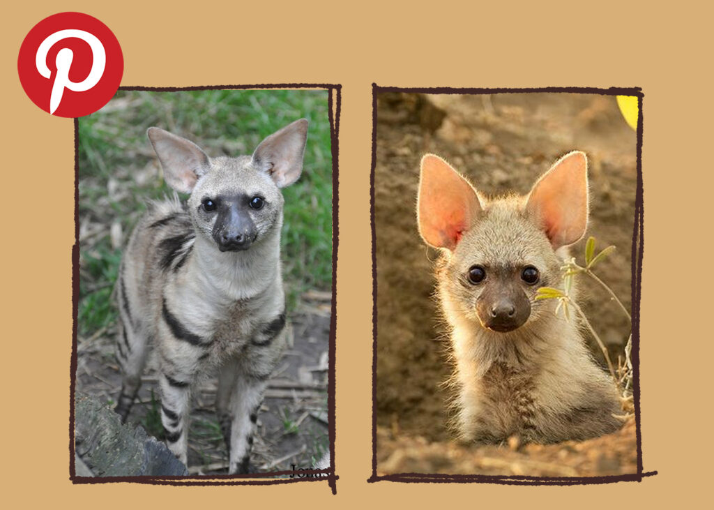
For this particular piece I also directly referenced photos of aardwolves! They are the animal that Rosie is based on, and when I’m struggling with her face, looking at how theirs are structured can help me figure her out.
Line art & colouring
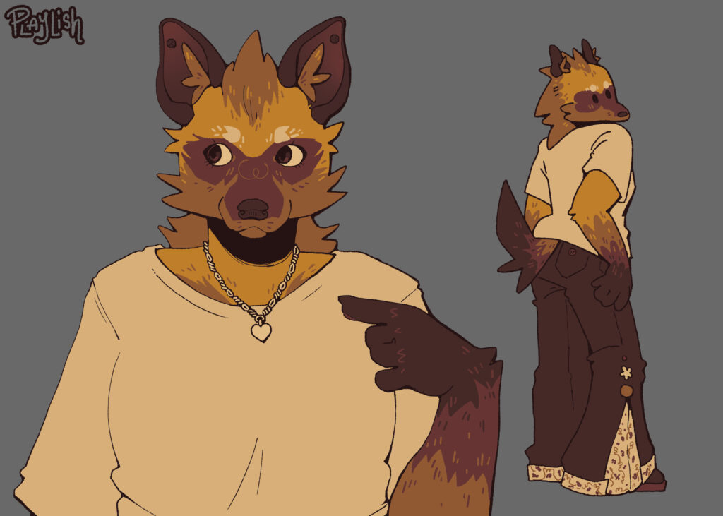
Line art is quite straight-forward; just choosing my favourite lines from the sketch and using those to create a clean finished product. I like to use textured/rough brushes that don’t have any transparency, as the transparency can disturb the colouring process.
When I am laying my flat colours, I always colour pick directly from a reference image. For my own OCs I have colour palette files which I import into each new drawing file that I create for them.
When drawing fur, I like to put some overlapping lines of colour to imitate the imperfection of how fur would lay in real life.
Rendering
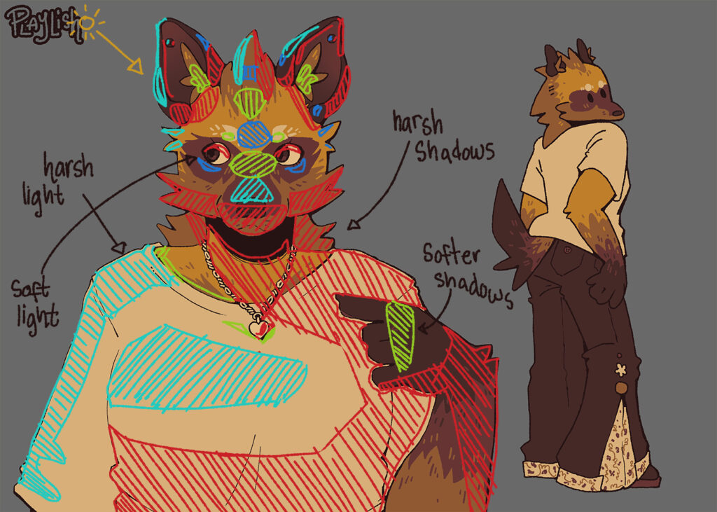
I have made a crude diagram of how I placed the light and shadows on this piece. When rendering, remember that you’re trying to create depth, so when you see my red “harsh shadow” indicator right next to the light blue “harsh light” indicator, those two parts of the character have the most depth between them. This only really occurs in the ears for this specific example.
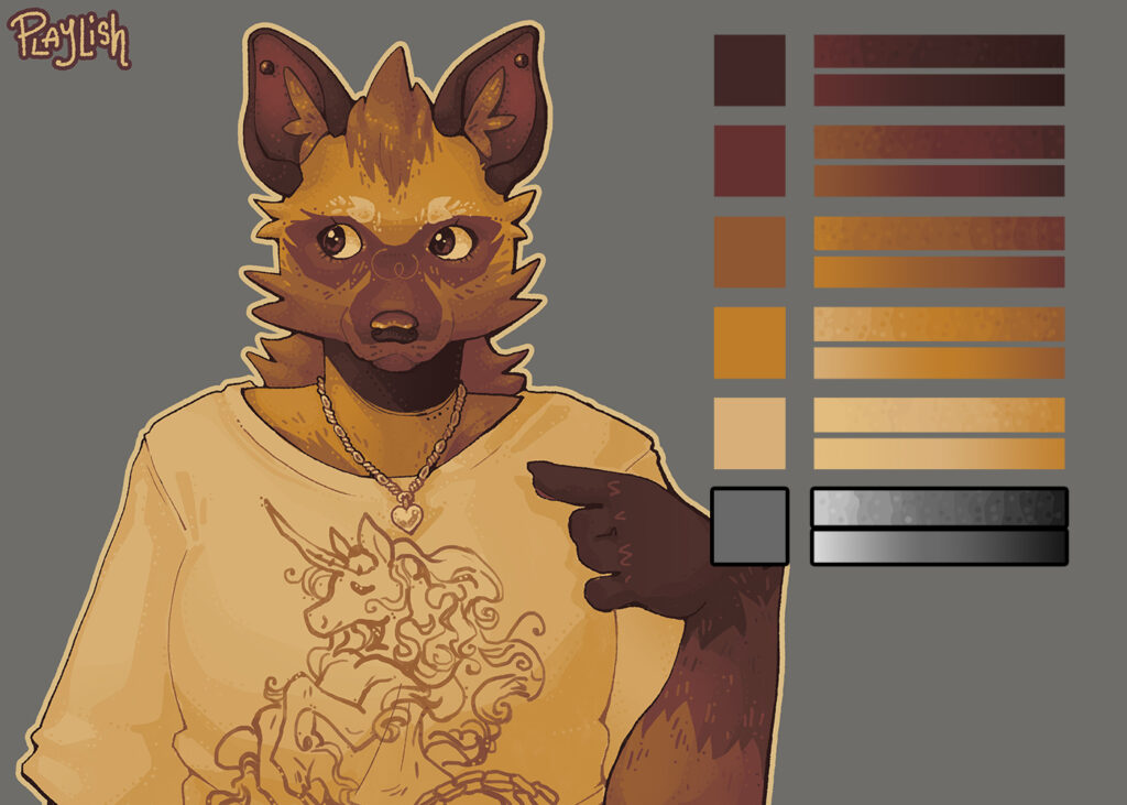
More recently I’ve stopped using layer modes (multiply, overlay, etc.) for the majority of my shading. When I’m drawing my own OCs, their colour palettes are specifically set up to have colours throughout the value range, which allows me to mix between those and shade with them.
This strategy can easily result in muddy rendering if the light end of one colour ends up near the dark end of its neighbour colour. I, personally, haven’t felt like I’ve had this issue, and I really enjoy the harmony that it can bring to the piece.
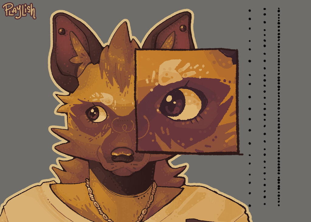
After I am happy with the shading I’ve done, I like to add a finishing touch of some stippling dots. I use these where shading is present mostly, as well as sometimes to add to flat-colour gradients.
Background
Usually, for me, the background is not a very difficult part of the drawing. They used to be often flat colours, but more recently are scenes which I have pre-planned. For this piece, however, I had no good idea for a background.
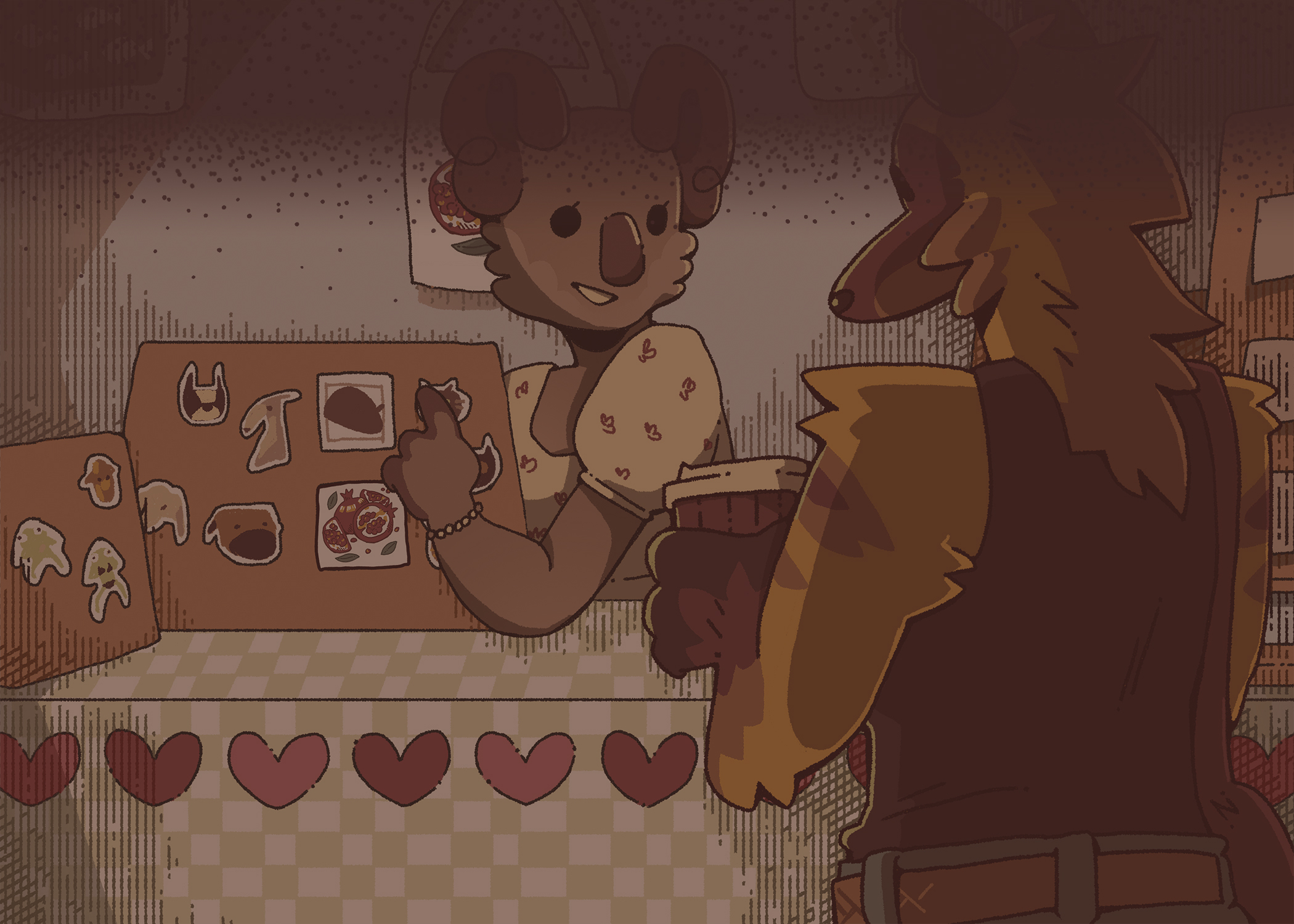
I tried many different options, and consulted many of my friends to decide on the background for this piece. Have a look!
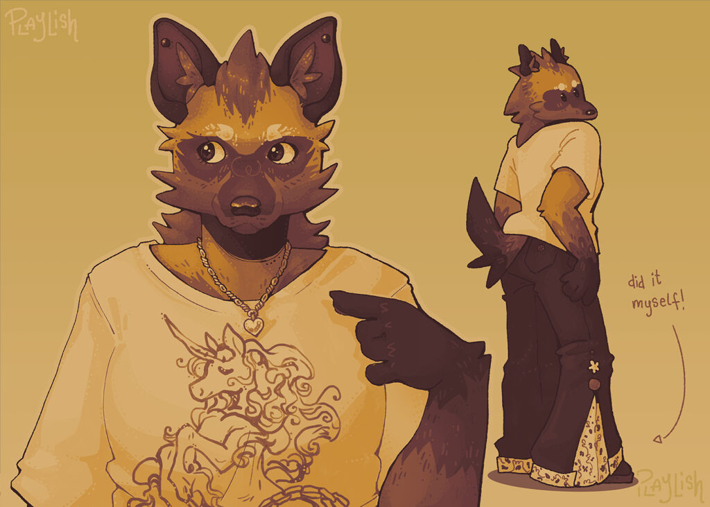
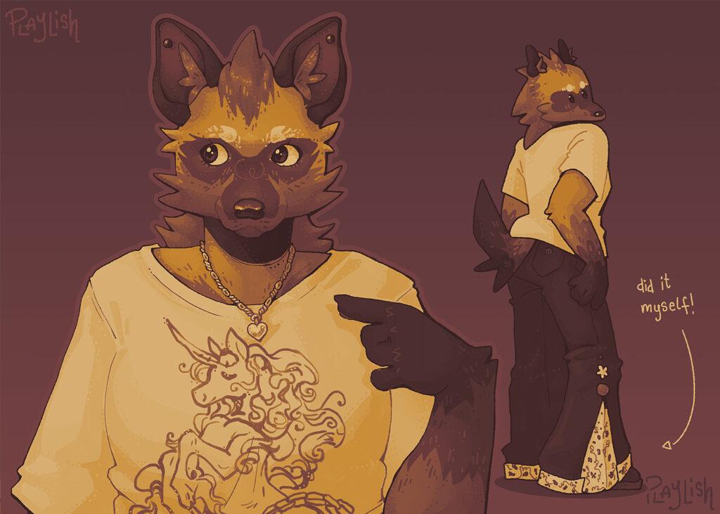
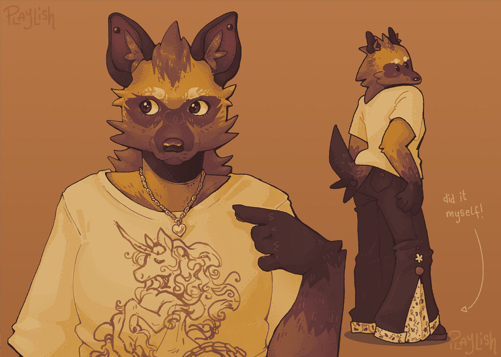
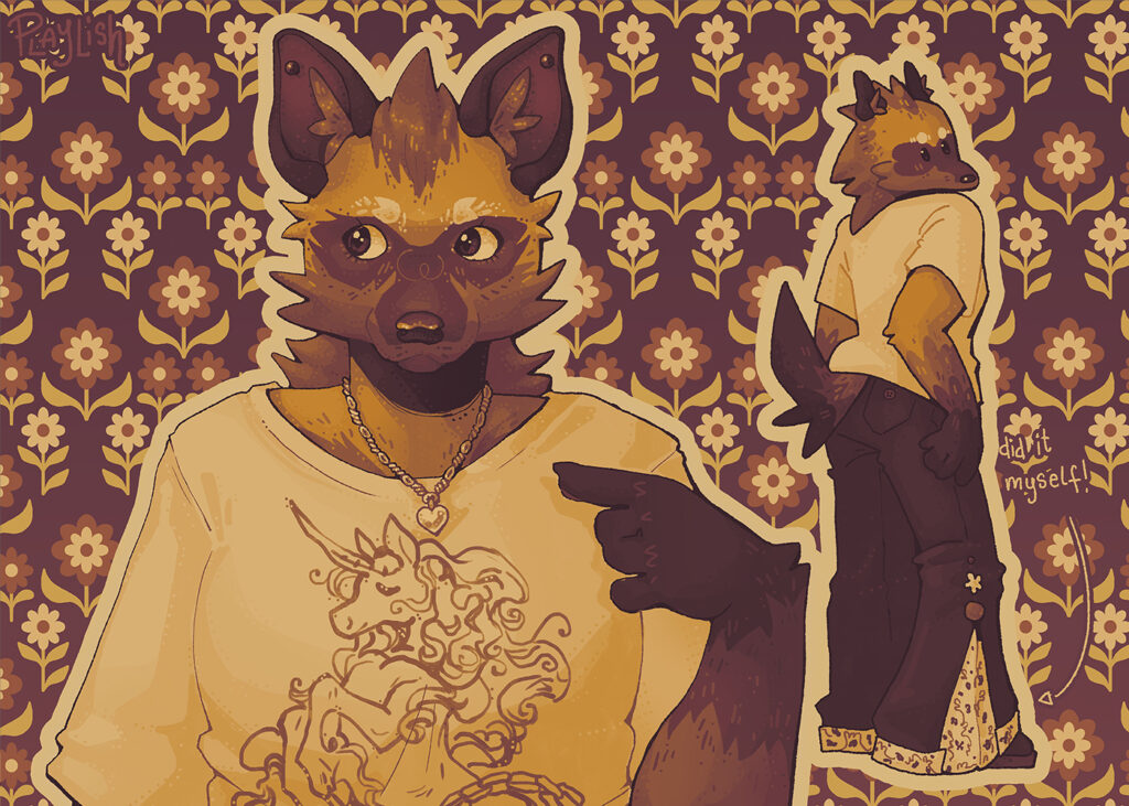
And that’s not even all of them!
Comparisons
Did you know that Rosie is a little over 2 years old? In that time, I have drawn her a lot! While I was doing this particular illustration, however, I was reminded of my earlier art pieces of her.
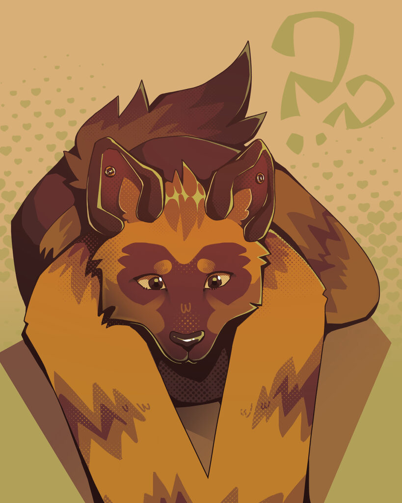
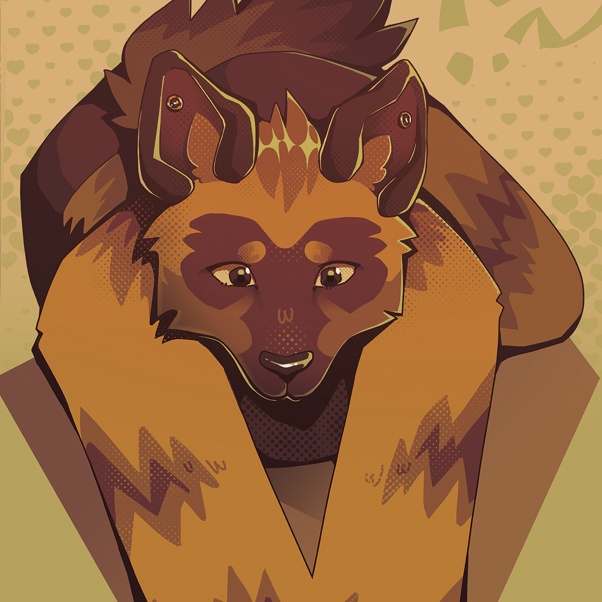
This one was the most obvious comparison for me. This piece was one of her very earliest, being created in February of 2024. If I remember correctly, this was my third illustration of her ever!
I am reminded of this piece likely due to the proportions, mainly of the ears to head ratio. Over time, her ears have gotten smaller and smaller. It’s only when looking at an actual aardwolf that I am reminded how dang big their ears really are!
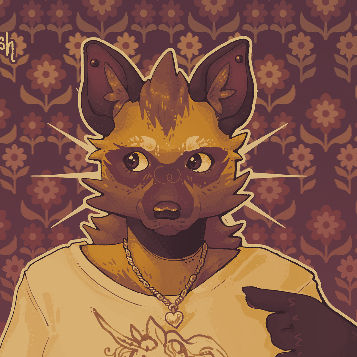
This is probably the next illustration that I would refer to as similar. This is her absolute first digital illustration, where I was just figuring out her design. Obviously, at the time, I was working more directly off the actual animal for proportions and such.
This is one of my personal favourites out of my body of work. I love the colour blocky-ness of it. I think that choosing to not have any rendering was a good choice here.
Improvement
Here is a direct look at the differences between the older and newer art pieces of her. It’s only times like this where I realise how much I have actually improved in my work. I am most proud of my newer confidence to create messy and imperfect art. Not dwelling on the small details allows for me to more freely create, and isn’t that the ultimate goal?
Particularly here, I’d note that my general anatomy has seemingly improved, my rendering has progressed, and my understanding and use of colours is evolving – however restricted I like to keep myself.